Reporting
- A graphic representation that uses various chart styles.
- A tabular textual representation that contains exact figures.
- Historic Report � A report, for a specific time frame, that is generated once and saved for historic purposes, and is available for future reference.
- Template Report � A report based on specific parameters, which may be generated many times over, each time for a different time frame. A Template Report may be fine-tuned each time to fit your needs.
- Device Group Reports
- Device Reports
- Interface Reports
- Account Reports
- Cost Centre Reports
- IP Address Reports
- IP and Port Reports
- AS Reports
- Protocol Reports
- Port Reports
- Qos Reports
- Baseline Reports
- Custom Reports
- A monthly Device Group Report
- An hourly Device Group Report
- In the Navigation Pane, expand the Long-Term menu.
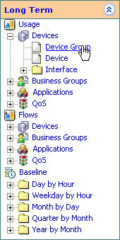
- Select Long-Term > Devices > Device Group . The
report is displayed appears in the display section.
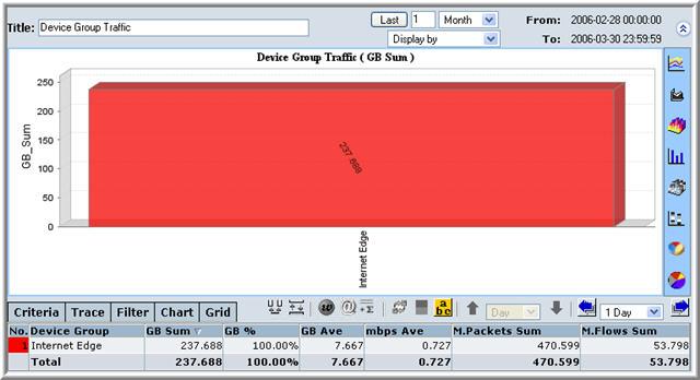
- At this stage, you can choose a different type of graphic display or fine-tune the report.
- In the Navigation Pane, expand the Real-Time menu.
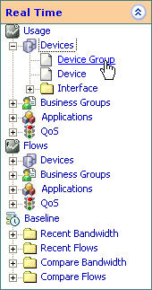
- Select Real-Time > Devices > Device Group . The
report is displayed appears in the display section.
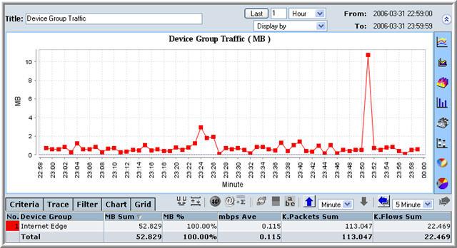
- At this stage, you can choose a different type of graphic display or fine-tune the report.
- A monthly Device Report
- An hourly Device Report
- In the Navigation Pane, expand the Long-Term menu.
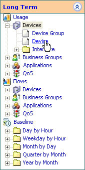
- Select Long-Term > Devices > Device . The report
is displayed appears in the display section.
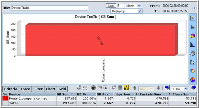
- At this stage, you can choose a different type of graphic display or fine-tune the report.
- In the Navigation Pane, expand the Real-Time menu.
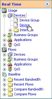
- Select Real-Time > Devices > Device . The report is
displayed appears in the display section.
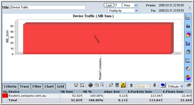
- At this stage, you can choose a different type of graphic display or fine-tune the report.
- A monthly Interface Report
- An hourly Interface Report
- In the Navigation Pane, expand the Long-Term menu.
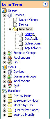
- Select Long-Term > Devices > Interface >
Source/Destination. The report is displayed appears in the display
section.
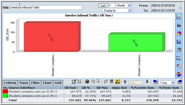
- At this stage, you can choose a different type of graphic display or fine-tune the report.
- In the Navigation Pane, expand the Real-Time menu.
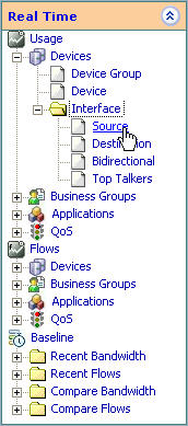
- Select Real-Time > Devices > Interface >
Source/Destination. The report is displayed appears in the display
section.
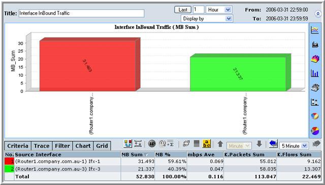
- At this stage, you can choose a different type of graphic display or fine-tune the report.
- A monthly Account Report
- An hourly Account Report
- In the Navigation Pane, expand the Long-Term menu.
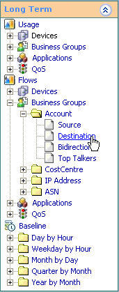
- Select Long-Term > Business Groups > Account >
Source/Destination. The report is displayed appears in the display
section.
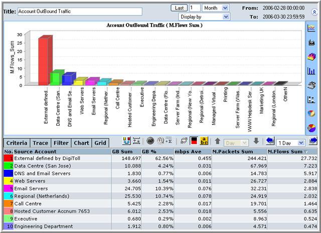
- At this stage, you can choose a different type of graphic display or fine-tune the report.
- In the Navigation Pane, expand the Real-Time menu.
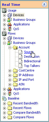
- Select Real-Time > Business Groups > Account >
Source/Destination. The report is displayed appears in the display
section.
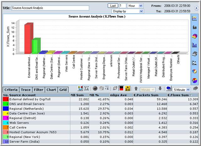
- At this stage, you can choose a different type of graphic display or fine-tune the report.
- A monthly Cost Centre Report
- An hourly Cost Centre Report
- In the Navigation Pane, expand the Long-Term menu.
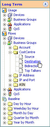
- Select Long-Term > Business Groups > CostCentre >
Source/Destination . The report is displayed appears in the display
section.
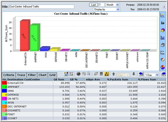
- At this stage, you can choose a different type of graphic display or fine-tune the report.
- In the Navigation Pane, expand the Real-Time menu.
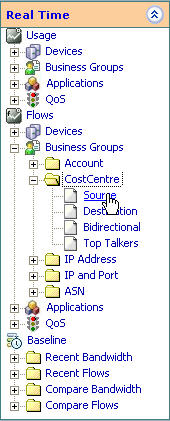
- Select Real-Time > Business Groups > CostCentre >
Source/Destination. The report is displayed appears in the display
section.
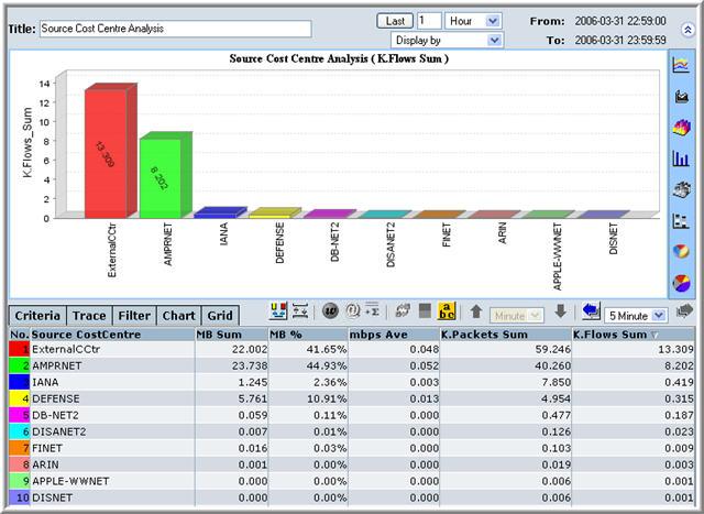
- At this stage, you can choose a different type of graphic display or fine-tune the report.
- A monthly IP Address Report
- An hourly IP Address Report
- In the Navigation Pane, expand the Long-Term menu.
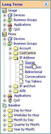
- Select Long-Term > Business Groups > IP Address >
Source/Destination. The report is displayed appears in the display
section.
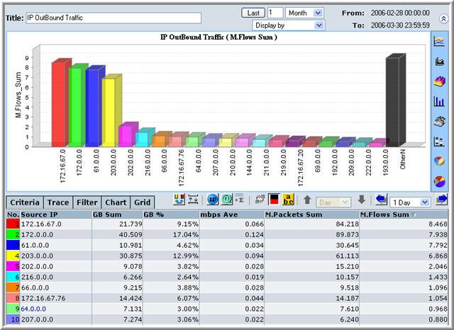
- At this stage, you can choose a different type of graphic display or fine-tune the report.
- In the Navigation Pane, expand the Real-Time menu.
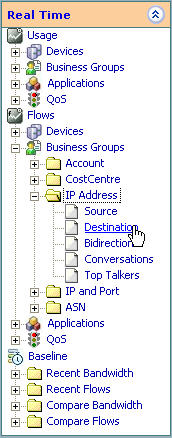
- Select Real-Time > Business Groups > IP Address >
Source/Destination. The report is displayed appears in the display
section.
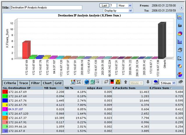
- At this stage, you can choose a different type of graphic display or fine-tune the report.
- A monthly IP and Port Report
- An hourly IP and Port Report
- In the Navigation Pane, expand the Long-Term menu.
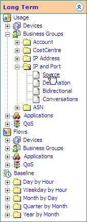
- Select Long-Term > Business Groups > IP and Port >
Source/Destination. The report is displayed appears in the display
section.
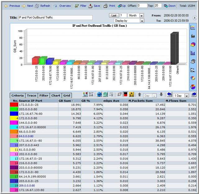
- At this stage, you can choose a different type of graphic display or fine-tune the report.
- In the Navigation Pane, expand the Real-Time menu.
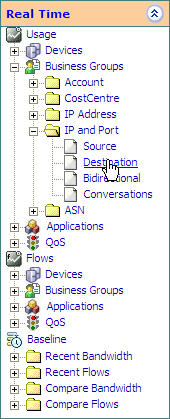
- Select Real-Time > Business Groups > IP and Port >
Source/Destination. The report is displayed appears in the display
section.
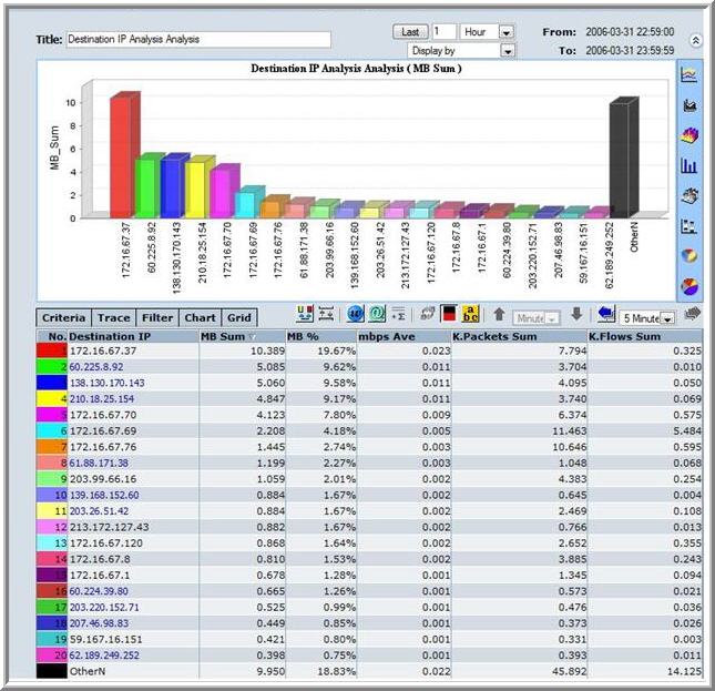
- At this stage, you can choose a different type of graphic display or fine-tune the report.
- A monthly AS Report
- An hourly AS Report
- In the Navigation Pane, expand the Long-Term menu.
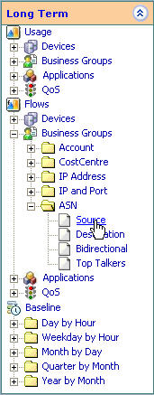
- Select Long-Term > Business Groups > AS >
Source/Destination. The report is displayed appears in the display
section.

- At this stage, you can choose a different type of graphic display or fine-tune the report.
- In the Navigation Pane, expand the Real-Time menu.
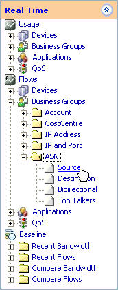
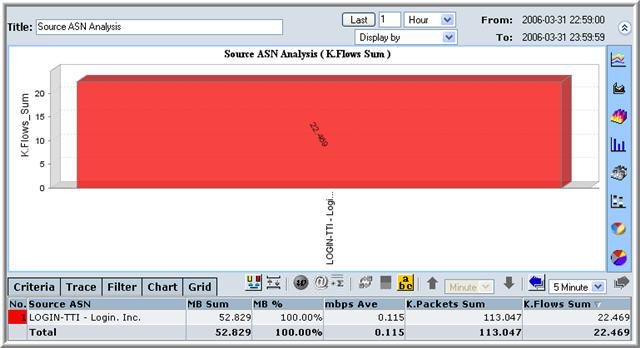
- Select Real-Time > Business Groups > AS >
Source/Destination. The report is displayed appears in the display
section.
- At this stage, you can choose a different type of graphic display or fine-tune the report.
- A monthly Protocol Report
- An hourly Protocol Report
- In the Navigation Pane, expand the Long-Term menu.
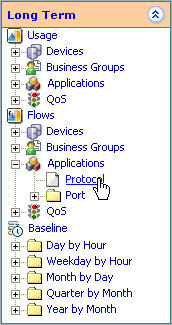
- Select Long-Term > Applications > Protocol. The
report is displayed appears in the display section.
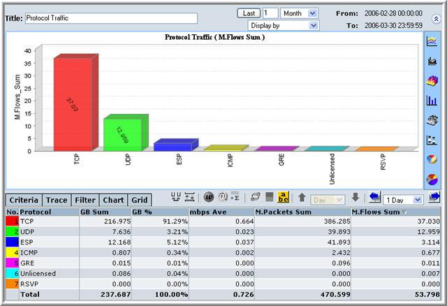
- At this stage, you can choose a different type of graphic display or fine-tune the report.
- In the Navigation Pane, expand the Real-Time menu.
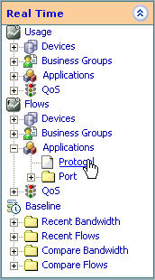
- Select Real-Time > Applications > Protocol. The
report is displayed appears in the display section.
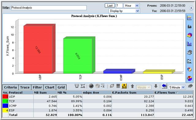
- At this stage, you can choose a different type of graphic display or fine-tune the report.
- A monthly Port Report
- An hourly Port Report
- In the Navigation Pane, expand the Long-Term menu.
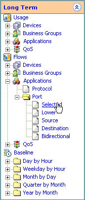
- Select Long-Term > Applications > Port. The report
is displayed appears in the display section.
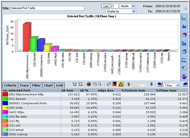
- At this stage, you can choose a different type of graphic display or fine-tune the report.
- In the Navigation Pane, expand the Real-Time menu.
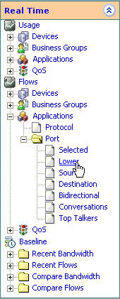
- Select Real-Time > Applications > Port. The report
is displayed appears in the display section.
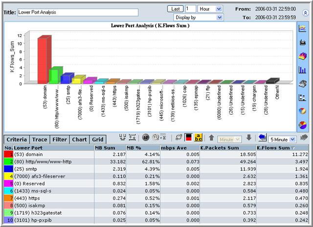
- At this stage, you can choose a different type of graphic display or fine-tune the report.
- A monthly QoS Report
- An hourly QoS Report
- In the Navigation Pane, expand the Long-Term menu.
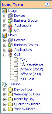
- Select Long-Term > Applications > QoS. The report
is displayed appears in the display section.
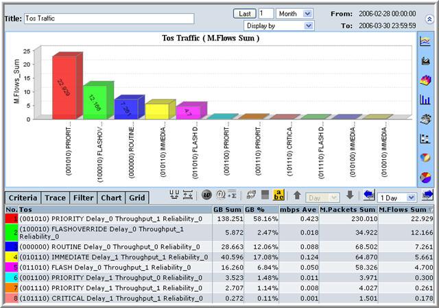
- At this stage, you can choose a different type of graphic display or fine-tune the report.
- In the Navigation Pane, expand the Real-Time menu.
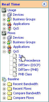
- Select Real-Time > Applications > QoS >
Selected/Lower/Source/Destination. The report is displayed appears in
the display section.
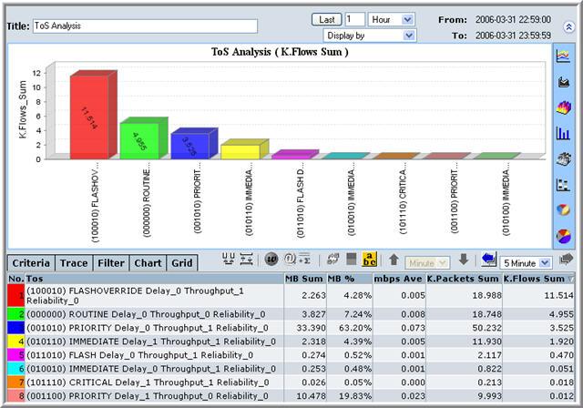
- At this stage, you can choose a different type of graphic display or fine-tune the report.
- Day By Hour
- Weekday by Hour
- Month by Day
- Quarter by Month
- Year by Month
- Recent Bandwidth
- Recent Flows
- Bandwidth Comparison
- Flow Comparison
- Generate your report. For example, a monthly Protocol Report.
- Click the Filter button.

The Filter Screen is displayed in the Display Section.
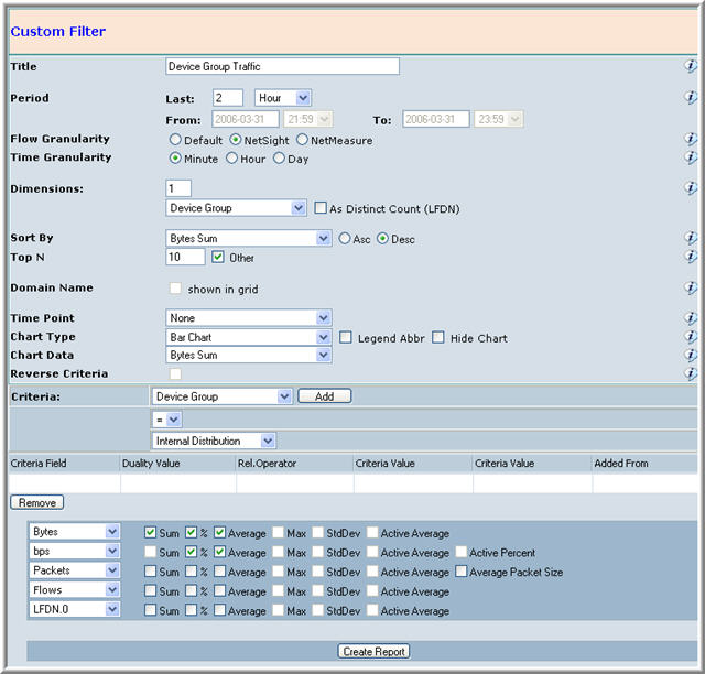
The filter screen is populated with the previous report�s data filtering criteria.
- Change any of the properties as you see fit.
- Click Generate Report.
Zoom into a Report
^Top The zooming functionality is available for the Netflow Auditor charting applet. Users can zoom into all bar, line and area charts.
You can zoom into a report to reveal more intricate details.
To zoom down into a report:
- Generate a report.
Following is an example of a weekly baseline report.
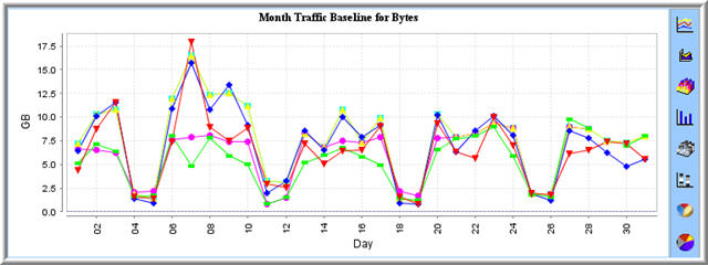
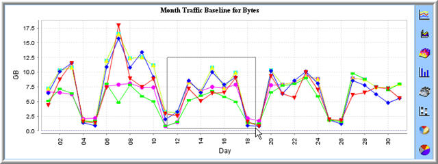
- Drag the mouse to select an area within the graph into which you wish to
drill down.
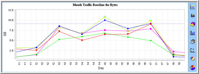
A new graph is displayed elaborating only the selected area with greater detail.
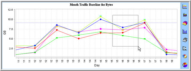
- Repeat Step 2, as many times as you want.
Drill-Down into a Report
^Top The drill-down functionality of Netflow Auditor gives the user single point analysis of traffic from the charting applet. All charts can be analyzed through the drill-down menu by using the right-click button of the mouse.
To drill-down into a chart:
- For line charts focus on a single point by clicking on a single point locater. For bar, area and pie charts skip to step 2. For charts with a lot of detail zoom in for more accurate drill-down analysis. See Custom Reports Zoom.
- Right-click on the focus point/area to access the advanced template drill down menu.
- Left-click on the focus point/area to access the basic template drill down menu.
- Select from the drill-down menu to analyze Devices/Business Groups/Applications/Time.
- Continue to drill-down on single points to further analyze traffic.
Format By Right Clicking on Chart
^Top When the user presses the right mouse button over an element of a chart, the following pop-up menu will appear.
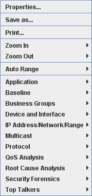
In the next two sections reference will be made to the first five segments of this menu, which are separated by a blue horizontal line. The first five segments of the menu are concerned with changing the appearance, printing and saving. In this section we will look at the first menu item, and in the next section we will look at the next four menu items. The following menu items will be considered immediately below.
- Properties
- Save as...
- Print...
- Zoom In
- Zoom Out
- Auto Range
When the user selects the Properties menu item, the following dialog pop-up will appear.

The dialog pop-up that appears features a tabbed pane with the following tab labels
- Title
- Plot
- Other
The Title tab allows the user to format the heading of the graph. The user can change the title of the graph if needed, change the title's typeface and color.
The second tab is labelled Plot and this in turn contains a tabbed pane with the following tabs.
- Domain Axis
- Range Axis
- Appearance
The Domain Axis tab is shown below.
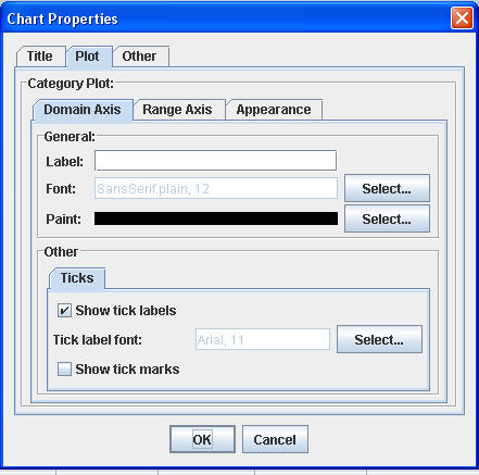
The Range Axis tab is shown below.

Here the Domain Axis and Range Axis tabs function in exactly the same way. These tab allow the user to format the domain (horizontal) axis and the range (vertical) axis in terms of title, font and color. Additionally these tabs allow the user to format the actual axes in terms of whether or not ticks are required.
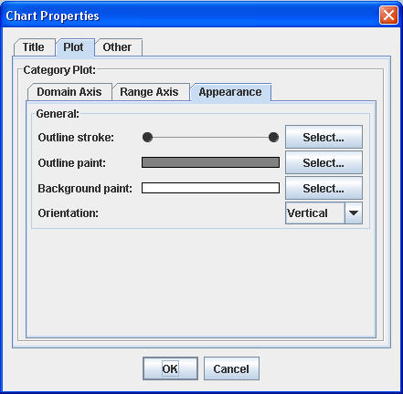
With this tab, the user can change the appearance of
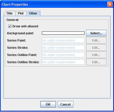
Outline Stroke: The user is here able to change the thickness of the lines that surround the graph. Outline Paint: The user is here able to change the color of the lines that surround the graph. Background Paint: The user is here able to change the background color of the area that is bounded by the outline. Orientation: This drag down menu allows the user to select a horizontal or vertical oritientation for the content of the graph. The last tab from the Properties menu item, which is shown below, allows the user to change the background color of the chart and change series color and stroke thickness.
Right Click Chart Menu
^Top The right click menu of the chart has been discussed in this section, the section above and the section below. The middle section of this menu contains the following menu items.
Save as... Allows the user to save a generated report. Print... Allows the user to print a generated report. Zoom In Zooms into the chart at the point where the mouse points. The user is given a choice to zoom in on either the Domain or Range axes or both at the same time. Zoom Out Zooms out of the chart at the point where the mouse points. The user is given a choice to zoom out on either the Domain or Range axes or both at the same time. Auto Range After the user has zoomed in/out and wants to return to the original proportions, the user can select this menu. The user is given a choice to automate the proportions of either the Domain or Range axes or both at the same time. Filtering Inside A Graph Or Chart
^Top There are a number of ways of drilling down to a greater level of detail in NetflowAuditor. One convenient way allows the user to interact with graphical output from previous queries. The user can move the cursor over a column in a bar chart or on a point on a timeline and then right-click the mouse to produce the following menu.

This menu is broken up into six sections that are segregated by a horizontal line. We are concentrating on the bottom section of the menu. This section has the following menu items:
- Application
- Baseline
- Business Groups
- Device and Interface
- IP Address/Network/Range
- Multicast
- Protocol
- QoS Analysis
- Root Cause Analysis
- Security Forensics
- Top Talkers
Of the menu items listed above, we can separate the menu items into sub groups. The following menu items:
- Application
- Baseline
- Business Groups
- Device and Interface
- IP Address/Network/Range
- Multicast
- Protocol
- QoS Analysis
- Top Talkers
All have a submenu made up of the following menu items:
- Usage
- Utilization
- Packets
- Packet Size
- Flows
These submenu items have been provided for the convenience of the user to collate the data into meaningful subgroupings.
Additionally the Root Cause Analysis menu also contains the submenus Usage, Utilization and Flow.
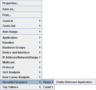
The Security Forensics menu also contains the Flow menu item.
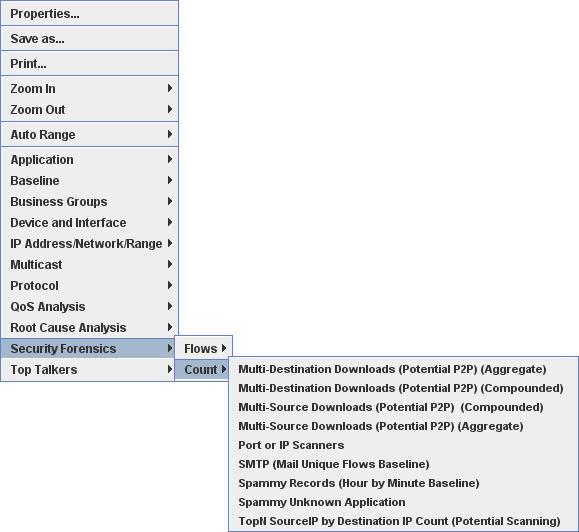
Root Cause Analysis and Security Forensics contain the Count menu item.
The Usage Menu
When the user selects a submenu from the Usage menu, they are essentially collating the data as if they were selecting the following Grid options within the charting applet.

The Utilization Menu
When the user selects a submenu from the Utilization menu, they are essentially collating the data as if they were selecting the following Grid options within the charting applet.

The Packets Menu
When the user selects a submenu from the Packets menu, they are essentially collating the data as if they were selecting the following Grid options within the charting applet.
The graph produced concentrates on the Packet Sum

The Packet Size Menu
When the user selects a submenu from the Packets Size menu, they are essentially collating the data as if they were selecting the preceding Grid options within the charting applet.
The grid is identical to that for the Packets Grid, but the graph concentrates on the Packet Size
The Flows Menu
When the user selects a submenu from the Flows menu, they are essentially collating the data as if they were selecting the following Grid options within the charting applet.

The Count Menu
When the user selects a submenu from the Count menu, they are essentially collating the data as if they were selecting the following Grid options within the charting applet.

We will now take a brief look at each of the menu items in the following section.
The Application Submenu
Selecting the Application menu item, results in a submenu with the following choices:
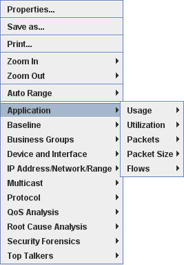
The secondary menu is used to determine the vertical axis of the graph that is produced.
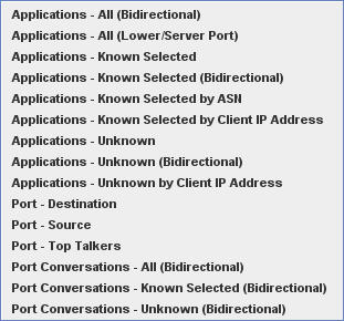
The final menu which is shown below is common to all five elements of the secondary menu. This final menu is used to determine the horizontal axis of the graph that will be produced.
The Baseline Submenu
Selecting the Baseline menu item, results in a submenu with the following choices:
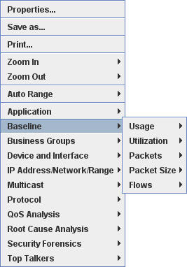
The secondary menu is used to determine the vertical axis of the graph that is produced.
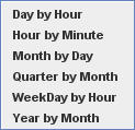
The final menu which is shown below is common to all five elements of the secondary menu. This final menu is used to determine the horizontal axis of the graph that will be produced.
The Business Groups Submenu
Selecting the Business Group menu item, results in a submenu with the following choices:
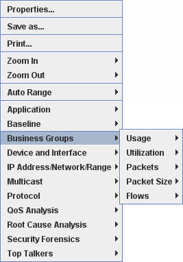
The secondary menu is used to determine the vertical axis of the graph that is produced.
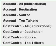
The final menu which is shown below is common to all five elements of the secondary menu. This final menu is used to determine the horizontal axis of the graph that will be produced.
The Device and Interface Submenu
Selecting the Device and Interface menu item, results in a submenu with the following choices:
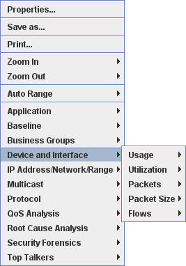
The secondary menu is used to determine the vertical axis of the graph that is produced.
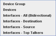
The final menu which is shown below is common to all five elements of the secondary menu. This final menu is used to determine the horizontal axis of the graph that will be produced.
The IP Address/Network/Range Submenu
Selecting the IP Address/Network/Range menu item, results in a submenu with the following choices:
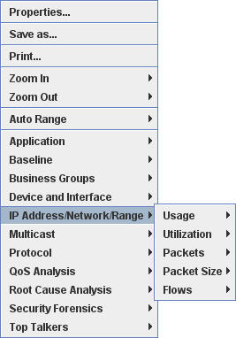
The secondary menu is used to determine the vertical axis of the graph that is produced.
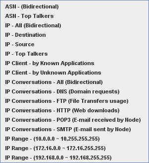
The final menu which is shown below is common to all five elements of the secondary menu. This final menu is used to determine the horizontal axis of the graph that will be produced.
The Multicast Submenu
Selecting the Multicast menu item, results in a submenu with the following choices:
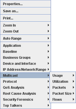
The secondary menu is used to determine the vertical axis of the graph that is produced.

The final menu which is shown below is common to all five elements of the secondary menu. This final menu is used to determine the horizontal axis of the graph that will be produced.
The Protocol Submenu
Selecting the Protocol menu item, results in a submenu with the following choices:
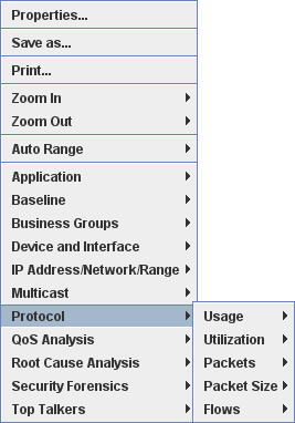
The secondary menu is used to determine the vertical axis of the graph that is produced.

The final menu which is shown below is common to all five elements of the secondary menu. This final menu is used to determine the horizontal axis of the graph that will be produced.
The QoS Analysis Submenu
Selecting the QoS Analysis menu item, results in a submenu with the following choices:
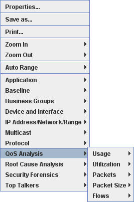
The secondary menu is used to determine the vertical axis of the graph that is produced.
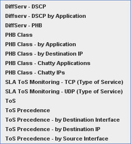
The final menu which is shown below is common to all five elements of the secondary menu. This final menu is used to determine the horizontal axis of the graph that will be produced.
The Root Cause Analysis Submenu
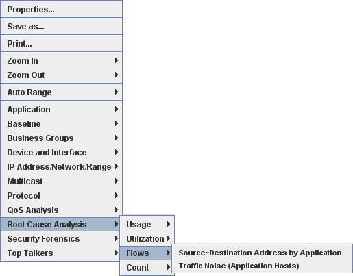
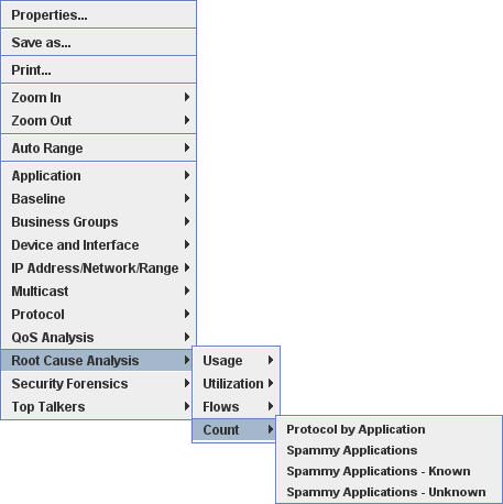
Selecting the Root Cause Analysis menu item, results in submenus with the following choices:
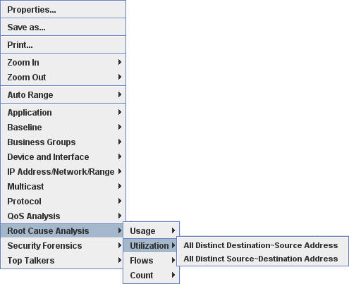
The following secondary menus are used to determine the vertical axis of the graph that is produced.
For Usage this is the secondary menu:
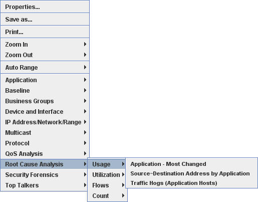
For Utilization this is the secondary menu:
For Flows secondary menu:
For Count secondary menu:
The Security Forensics Submenu
Selecting the Security Forensics menu item, results in submenus with the following choices:
The following secondary menus are used to determine the vertical axis of the graph that is produced.
For Count this is the secondary menu:
The Top Talkers Submenu
Selecting the Top Talkers menu item, results in a submenu with the following choices:
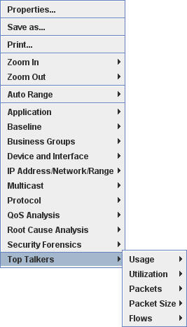
The secondary menu is used to determine the vertical axis of the graph that is produced.

Drill-Down Into Graphics for Time
^Top In the section above we made use of the mouse's right button to access menus, that allowed the user to redefine the Report. We will now look at a way that allows us to use the charting applets features to drill-down with respect to time. Very often the user will need to access the same report but for an earlier timeframe. Fortunately, NetflowAuditor allows the user to do this with ease.
The best way to illustrate this feature is with a scenario. Here we begin by looking at a report that was generated for IP Outbound Traffic for the time period of March, 2006. This report looks at the data gathered for an entire month in terms of hours, this can be determined by looking at the right side of the applet, just below the graphical output. There are four buttons in this area, the first buttons are the Up and Down buttons, to the right of this are the Previous and Next buttons. Here we can determine the smallest increment of time that is being considered in the report.
Note that the time period in question is indicated in the top right hand corner of the charting applet. Here we see that we are looking at the data for a month.
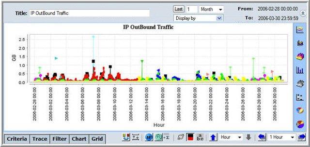
By looking carefully at this graph, we see the data points being represented by a series of shapes that are in different colors. Using multiple colors and shapes in this way allows the user to follow a different series of data that represents a different row, in the tabular data below the actual graph. Note that the shapes are circular, square and triangular, and from this we are able to determine whether the report is coarse-grained or fine-grained. Here the line is made up of hundreds of data points, and this is not always useful.
We can make the data a little less fine-grained in this case by pressing the Up button. By doing this we now consider the data for the month in terms of days. This can be seen below, look for the icon of the hand pressing the Up button.

Notice that the upper right hand corner of the charting applet has not changed at all. We are still looking at the same month as before.
What happens if the user presses the Up button until the increment is the same as the period being considered..
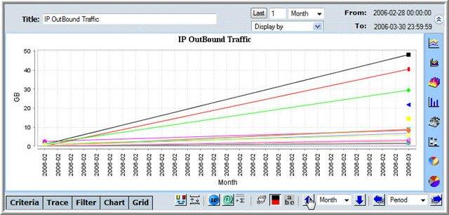
This is not usually very useful, but it has been included for illustrative purposes. We are now left with a graph with two data points for each series. We want to consider the data in terms of days so we drill-down back to days. This returns us to a graph, that should like the second graph we looked at before.
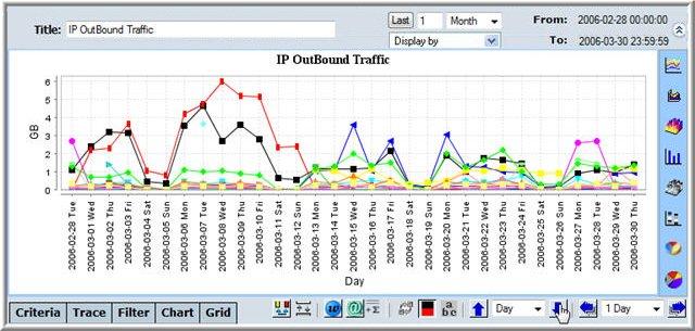
We now want to move forward in time, we want to look at the month for the seven day period following the original report. The original report was for 2/28/2006 to 3/30/2006. We want to consider the week after both dates, the period from 3/7/2006 to 4/6/2006. We press the Next button and select a value of 7 day.
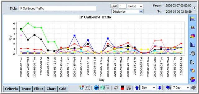
Now look carefully at the top right hand corner, notice the range of dates is exactly what we want. We now look at the actual graph, here we see that the last day being considered is 3/31/2006. What happened? In this particular case there was no data for april, so the data that is shown is correct.
Now let us consider the month 3 days before the previous graph, this means that we are looking at the period 3/4/06 to 4/3/06. We can see from the peaks in the graph have moved to the right as you would expect. Note that in the actual graph, the first day considered is the 4/3/06 and the last day is 3/31/06 as in the above graph, due to the data running out in april.
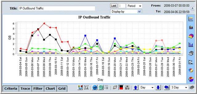
As we have just seen NetflowAuditor allows the user flexibility in changing the time period dynamically for any given report.
Saving a Report
^Top Saving reports is a very important process, not only for creating historical reports, but also for scheduling automated report production and delivery.
To save a report:
- Produce your report.
- Click Save.

The Report Destination Screen appears in the Display Section.
The Report Destination Screen appears in the Display Section.
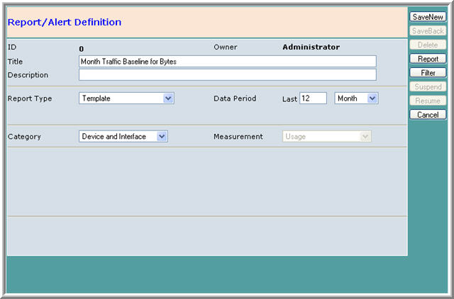
- Enter a Title for the report.
- Select a Type and Category for the report.
- Select a reporting period.
- (Optional) Enter a description for the report.
- Click Save New.
NetFlow Auditor Manual
Reporting |
^Top |
Traffic Analysis Reports |
^Top |
Netflow Auditor enables the user to perform live and historical analysis of netflow traffic, according to the level and type of network data they require. Traffic analysis works by means of querying the aggregated network traffic data collected by Netflow Auditor. The user may view the network data from various perspectives in the form of Traffic Analysis Reports.
The Traffic Analysis Report is displayed in the Display section of Netflow Auditor�s main screen.
There are two representations of the traffic analysis output:
Historic Reports and Template Reports
Reports are split into Historic and Template Reports:
Types of Reports
Reports can be categorised into the following types:
Device Group Reports |
^Top |
A Device Group Report is a traffic analysis report for Device Groups. A Device Group is a means by which to group devices together, so that a report may be produced displaying the summing up of several devices. When defining a Device it is associated with a Device Group.
See: Device Groups
A Device Group Report displays a summing up of all traffic for a given Device Group within a set time frame.
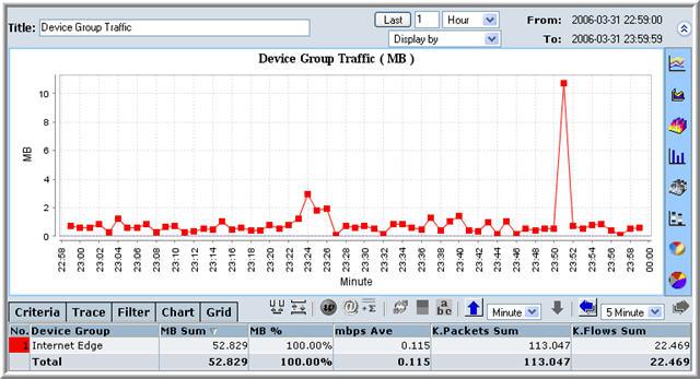
Generating a Device Group Report
You can generate two different Device Group Reports:
Monthly Device Group Reports
A monthly Device Group Report displays a summing up of all traffic for a given Device Group for every day within a month.
To generate a Monthly Device Group Report:
See: Filtering a Report
Hourly Device Group Reports
An Hourly Device Group Report displays a summing up of all traffic for a given Device Group for every minute within an hour.
To generate a Hourly Device Group Report:
See: Filtering a Report
Device Reports |
^Top |
A Device relates to a specific IP address, usually but not necessarily, to one specific machine. In this way, a report may be produced for a specific user on the Network.
See: Devices
A Device Report displays a summing up of all traffic for a given Device within a set time frame.
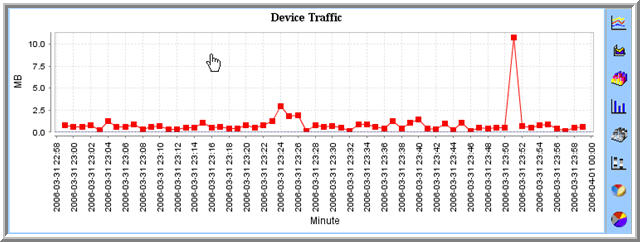
Generating a Device Report
You can generate two different Device Reports:
Monthly Device Reports
A monthly Device Report displays a summing up of all traffic for a given Device for every day within a month.
To generate a Monthly Device Report:
See: Filtering a Report
Hourly Device Reports
An Hourly Device Report displays a summing up of all traffic for a given Device for every minute within an hour.
To generate a Hourly Device Report:
See: Filtering a Report
Interface Reports |
^Top |
An Interface Report is a traffic analysis report for Interfaces. An Interface is a means by which to define several different entities within the same Device. For example, on the same machine, you may have several web servers running, each using a different protocol. You will want to monitor each of these separately.
See: Interfaces
A Interface Report displays a summing up of all traffic for a given Interface within a set time frame.
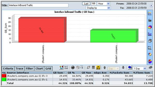
Generating an Interface Report
You can generate two different Interface Reports:
Monthly Interface Reports
A monthly Interface Report displays a summing up of all traffic for a given Interface for every day within a month.
To generate a Monthly Interface Report:
See: Filtering a Report
Hourly Interface Reports
An Hourly Interface Report displays a summing up of all traffic for all Interfaces for every minute within an hour.
To generate a Hourly Interface Report:
See: Filtering a Report
Account Reports |
^Top |
An Account Report is a traffic analysis report for Accounts. Accounts are units which are used in defining segments of your network. An account will mark different segments of your network that are used for the same purpose, or in the same context. An Account, therefore, may be associated with more than one Network segment.
See: Accounts
A Account Report displays a summing up of all traffic for a given Account within a set time frame.
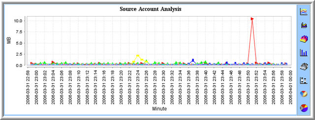
Generating an Account Report
You can generate two different Account Reports:
Monthly Account Reports
A monthly Account Report displays a summing up of all traffic for a given Account for every day within a month.
To generate a Monthly Account Report:
See: Filtering a Report
Hourly Account Reports
An Hourly Account Report displays a summing up of all traffic for all Accounts for every minute within an hour.
To generate a Hourly Account Report:
See: Filtering a Report
Cost Centre Reports |
^Top |
A Cost Centre Report is a traffic analysis report for Cost Centres. Cost Centres are units which are used in defining segments of your network. A Cost Centre will mark different segments of your network that are used for the same purpose, or in the same context. A Cost Centre, therefore, may be associated with more than one Network segment.
See: Cost Centres
A Cost Centre Report displays a summing up of all traffic for a given Cost Centre within a set time frame.
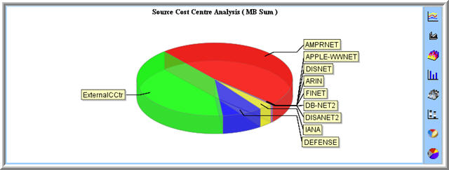
Generating an Cost Centre Report
You can generate two different Cost Centre Reports:
Monthly Cost Centre Reports
A monthly Cost Centre Report displays a summing up of all traffic for a given Cost Centre for every day within a month.
To generate a Monthly Cost Centre Report:
See: Filtering a Report
Hourly Cost Centre Reports
An Hourly Cost Centre Report displays a summing up of all traffic all given Cost Centres for every minute within an hour.
To generate a Hourly Cost Centre Report:
See: Filtering a Report
IP Address Reports |
^Top |
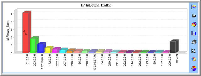
An IP Address Report is a traffic analysis report for IP Address'.
An IP Address Report displays a summing up of all traffic for all IP Addresses in a specified range within a set time frame. These can be either Source IP Addresses or Destination IP Addresses.
Generating an IP Address Report
You can generate two different IP Address Reports:
Monthly IP Address Reports
A monthly IP Address Report displays a summing up of all traffic for a given IP Address for every day within a month.
To generate a Monthly IP Address Report:
See: Filtering a Report
Hourly IP Address Reports
An Hourly IP Address Report displays a summing up of all traffic for all IP Address' for every minute within an hour.
To generate a Hourly IP Address Report:
See: Filtering a Report
IP and Port Reports |
^Top |
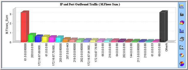
An IP and Port Report is a traffic analysis report for a specific port for a particular IP Address. This is represented by an IP address which is followed by a colon which in turn is followed by a port number, for example, 61.0.0.0:80000 is such a IP Port combination, please note that they are separated by the colon.
An IP and Port Report displays a summing up of all traffic for all IP Port combinations in a specified range within a set time frame. These can be either Source IP Addresses and Ports or Destination IP Addresses and Ports.
Generating an IP and Port Report
You can generate two different IP and Port Reports:
Monthly IP and Port Reports
A monthly IP and Port Report displays a summing up of all traffic for a given IP and Port combination for every day within a month.
To generate a Monthly IP and Port Report:
See: Filtering a Report
Hourly IP and Port Reports
An Hourly IP and Port Report displays a summing up of all traffic for all IP and Port combination for every minute within an hour.
To generate a Hourly IP and Port Report:
See: Filtering a Report
AS Reports |
^Top |
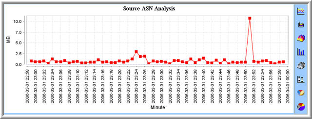
An AS Report is a traffic analysis report for AS Numbers. An AS Number is a unique identifier for a collection of IP networks and routers under the control of one entity.
See: AS Numbers
An AS Report displays a summing up of all traffic for a given AS Numbers within a set time frame.
Generating an AS Report
You can generate two different AS Reports:
Monthly AS Reports
A monthly AS Report displays a summing up of all traffic for a given AS Numbers for every day within a month.
To generate a Monthly AS Report:
See: Filtering a Report
Hourly AS Reports
An Hourly AS Report displays a summing up of all traffic for all AS Numbers for every minute within an hour.
To generate a Hourly AS Report:
See: Filtering a Report
Protocol Reports |
^Top |
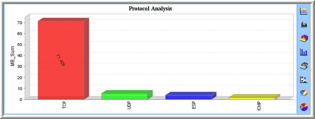
A Protocol Report is a traffic analysis report for Protocols. A Protocol is a set of rules governing communication between devices.
See: Protocols
A Protocol Report displays a summing up of all traffic for a given Protocol Numbers within a set time frame.
Generating an Protocol Report
You can generate two different Protocol Reports:
Monthly Protocol Reports
A monthly Protocol Report displays a summing up of all traffic for all Protocols for every day within a month.
To generate a Monthly Protocol Report:
See: Filtering a Report
Hourly Protocol Reports
An Hourly Protocol Report displays a summing up of all traffic for all Protocol for every minute within an hour.
To generate a Hourly Protocol Report:
See: Filtering a Report
Port Reports |
^Top |
A Port Report is a traffic analysis report for Ports. A port is a virtual data connection that can be used by Devices to exchange data directly.
See: Ports
A Port Report displays a summing up of all traffic for all Ports within a set time frame.
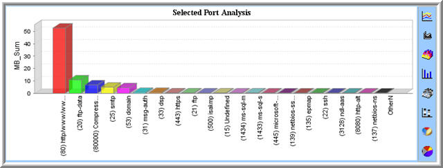
Generating an Port Report
You can generate two different Port Reports:
Monthly Port Reports
A monthly Port Report displays a summing up of all traffic for defined Ports for every day within a month.
To generate a Monthly Port Report:
See: Filtering a Report
Hourly Port Reports
An Hourly Port Report displays a summing up of all traffic for all Ports for every minute within an hour.
To generate a Hourly Port Report:
See: Filtering a Report
QoS Reports |
^Top |
A QoS Report is a traffic analysis report for QoS Levels. Quality of Service (QoS) refers to the probability of a packet succeeding in passing between two points in the network within its desired latency period. This creates a standard, by which the highest level of QoS is defined as �Best Effort� and this is succeeded by lower levels, in which each packet has to wait longer for the router to attend to it. Netflow Auditor enables you to analyze network traffic in relation to different QoS Levels
See: QoS
A QoS Report displays a summing up of all traffic for a given QoS Values within a set time frame.
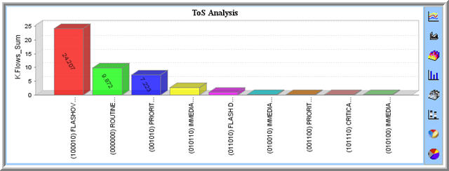
Generating an QoS Report
You can generate two different QoS Reports:
Monthly QoS Reports
A monthly QoS Report displays a summing up of all traffic for a given QoS Values for every day within a month.
To generate a Monthly QoS Report:
See: Filtering a Report
Hourly QoS Reports
An Hourly QoS Report displays a summing up of all traffic for all QoS Numbers for every minute within an hour.
To generate a Hourly QoS Report:
See: Filtering a Report
Baseline Reports |
^Top |
NetFlowAuditor provides a convenient mechanism for creating Baseline Reports. The Long Term menu can be expanded to reveal the Baseline menu tree which in turn can be expanded. The Baseline menu's submenus allows the user to select a standard time duration for the report and its increments, these are as follows:
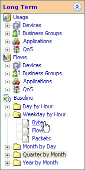
The resulting report of this scenario is presented below. The rows of the table show the Baseline data for each day (Monday, Tuesday, ...). The graph shows these days with a different color (the color in the first column of the table) over a 24 hour period.
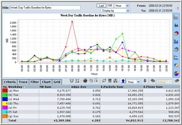
Note that Configuration menu can also produce Baseline reports. See the section on the Configuration menu for more details.
In a similary way to the Long Term menu, the Real Time menu allows Baseline Reporting in terms of:
This can be seen in the Baseline submenus of the Real Time menu (Recent Bandwidth, Recent Flows, Compare Bandwidth, Compare Flows). You can then drill down to the required detail by selecting the terminal menu items in the expanded menu tree. You can fine tune a report to a matter of days or hours.
Custom Reports |
^Top |
Filtering a Report |
^Top |
After a report is produced, you may want to fine-tune it to fit your needs. For example, you can change the granularity of the report.
To fine-tune a report:
