Traffic Analysis - The Charting Applet
The Charting Applet |
^Top |
The charting applet dominates the screens of the NetflowAuditor. This is where the data that is requested is presented to the user in a convenient way that aids visual communication. The charting applet is in turn made up of two halves. The top half shows a graphical representation of the data presented in the bottom half.
The graphical half of the applet contains many convenient buttons that allow the user to interact with the data. This section of the documentation will explain the purpose of the buttons that surround the graph.
We will first consider main graphical menu. Below is a screenshot of the main graphical menu.
![]()
The components of the main graphical menu are as follows:
- Next Button
- Time Step for Move Drag Down Box
- Previous Button
- Down Button
- Time Step for Drill Drag Down Box
- Up Button
- Show/Hide Legend Toggle Button
- Show/Hide Other Toggle Button
- Swap Dimensions of Stacked Bar Chart Toggle Button
- Summarize Bidirectional Data Toggle Button
- Show/Hide Domain Name
- Refresh Resolved IP
- Reverse Source Destination Criteria
- Swap Source Destination Field
- Grid Pane
- Chart Pane
- Filter Pane
- Trace Pane
- Criteria Pane
We will now look at the buttons that control the manipulation of time for the charting applet. These buttons are shown below.
![]()
The time section of the main graphical menu contains the following components:
- Up Button
- Time Step for Drill Drag Down Box
- Down Button
- Previous Button
- Time Step for Move Drag Down Box
- Next Button
The Up Button
| Pressing the Up button allows the user to see their data in a more coarse grained form. This will increase into the next increment of time unless specified in the Time Step for Drill Drag Down Box. |
The Down Button
| Pressing the Down button allows the user to see their data in a more finer grained form. This will decrease into the next increment of time unless specified in the Time Step for Drill Drag Down Box. The user is thus able to drill down into a finer detail for the data. |
Time Step for Drill Drag Down Box
| This drag down menu allows the user to conveniently select the required level of granularity for the graph they require. |
Previous Button
| Pressing the Previous button allows the user to move the period of data considered backwards in time. This means that the starting and finishing time of the period in question will be moved backwards in time by the value represented by the Time Step for Move Drag Down Box. |
Next Button
| Pressing the Next button allows the user to move the period of data considered forwards in time. This means that the starting and finishing time of the period in question will be moved forwards in time by the value represented by the Time Step for Move Drag Down Box. |
Time Step for Move Drag Down Box
This value represents the length of time that the user wants to move forward or backwards with respect to the original time frame. This series of buttons is described in the section Drill-Down Into Graphics for Time |
Show/Hide Legend Toggle Button
| This button is used to toggle the legend for the data represented on the horizontal axis of the graph. This is what the button looks like when legends occur on the horizontal axis. | |
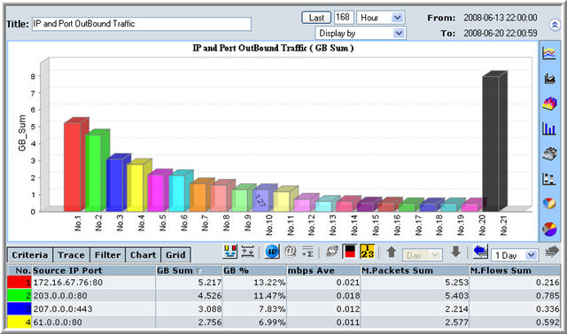
| Once the button is pressed it looks like the button to the left. This is easy to remember if you consider that the elements of the horizontal axis are now given the labels No 1, No 2, etc as on the button. |
The two screenshots below illustrate the use of the Show/Hide Legend button. All graphs default to showing the legend. The screenshot immediately below is the default just before the button is pressed. The cursor is hovering above the button allowing the tool tip to show itself.
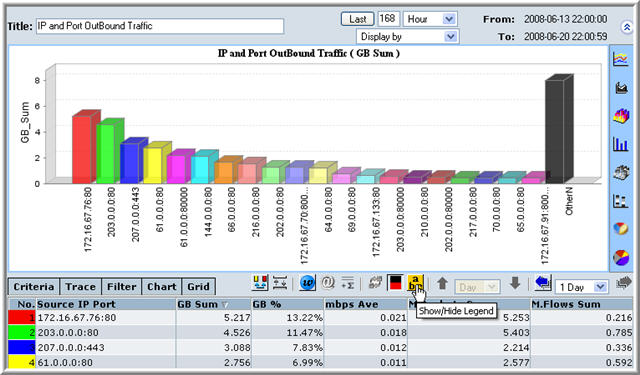
Once this button has been pressed, the values of the horizontal access elements change. Here they change from being IP addresses plus port numbers to being No.1, No. 2, No. 3, ......
Show/Hide Other Toggle Button
| This button is used to toggle the 'Other' data for the data represented on the horizontal axis of the graph. This is what the button looks like when the 'Other' data does occur on the horizontal axis. The 'Other' type of data is data that does not occur frequently enough to be listed, so it is grouped together. | |
| Once the button is pressed it looks like the button to the left. This is easy to remember if you consider that the element on the horizontal axis that is represented by the color black, is for 'Other' data. Note the lack of black on the pressed button. |
The two screenshots below illustrate the use of the Show/Hide Other button. All graphs default to showing the 'Other' data. The screenshot immediately below is the default just before the button is depressed (the button is pressed in default position). The cursor is hovering above the button allowing the tool tip to show itself.
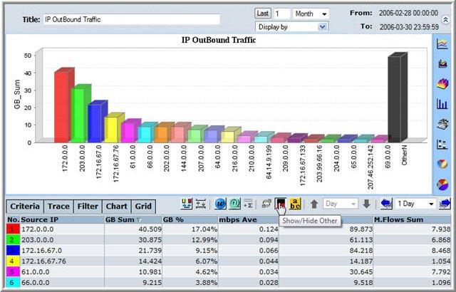
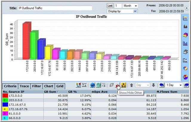
Once this button has been pressed, there is no column representing the 'Other' data, i.e., no black column.
Swap Dimension on Stacked Bar Toggle Button
| This button toggles graphs that are stacked bar graphs whic can be seen in multiple ways. This will be the graphically simpler option for each column. | |
| This will usually be the more complex looking graph. |
The two screenshots below illustrate the use of the Swap Dimensions on Stacked Bar button. All graphs default to showing the simpler representation of the data. The screenshot immediately below is the default just before the button is pressed. The cursor is hovering above the button allowing the tool tip to show itself.
Here we are representing the data from a bidirectional IP traffic report. Notice that all bars are stacks of two sections representing IP traffic going in and out. Here green is used to show the outgoing IP traffic and red is used to show incoming traffic.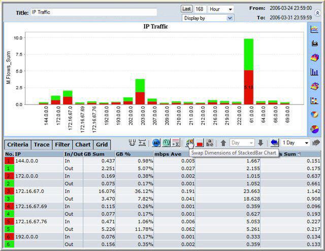
Once this button has been pressed, the data is compounded to represent ingoing traffic and outgoing traffic by the use of two columns.
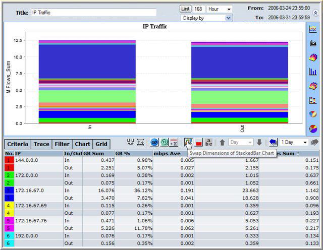
Summarize Bidirectional Data Toggle Button
| This button, if pressed, summarizes any bidirectional data in the tabular element of the charting applet. This can be seen instantly by the blue table entries. | |
| When this button is unpressed all the summaries are removed and the table just contains the raw data. |
The two screenshots below illustrate the use of the Summarize Bidirectional Data button. All graphs default to showing the bidirectional summaries in the data, these summaries are the blue entries in the table. The screenshot immediately below shows the button in the default pressed position. Here we are representing the data from a bidirectional IP traffic report. Notice the blue text which is framed by blue lines in the data table.
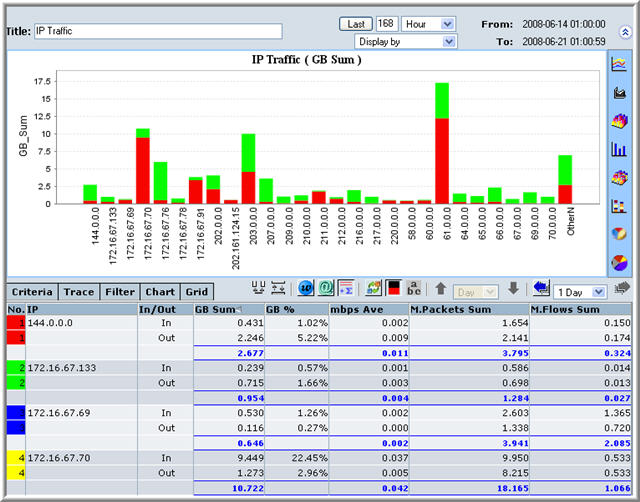
Once this button has been unpressed, the data all summaries are removed and there is no blue text in the table.
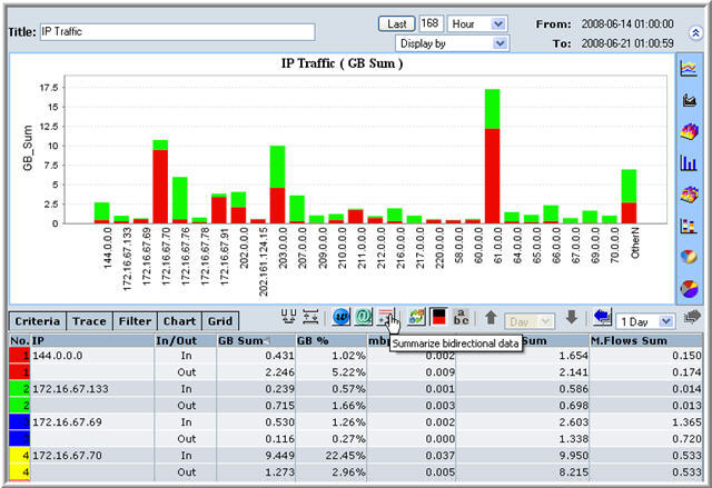
Show Hide Domain Name
| This button, if pressed, will show the domain name corresponding to an IP address next to it in brackets, if the domain name is part of the data. This isn't shown on the graph but it is shown on the data table. | |
| Pressing the button once it looks like the button to the left (i.e., depressed), will remove any domain names from the data table. |
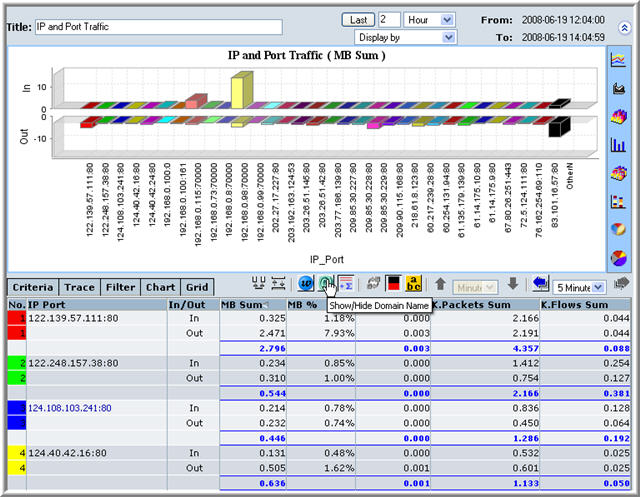
The two screenshots below illustrate the use of the Show/Hide Domain Name button. All graphs default to not showing the domain name of an IP address. The screenshot immediately below shows the button in the default unpressed position. Here we are about to press the button.
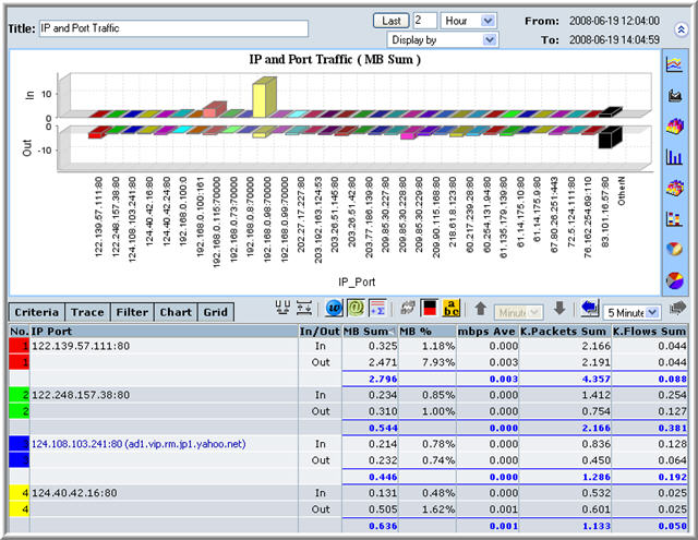
Once this button has been pressed, the domain names appear in the data table, note the yahoo domain name in the 3rd bidirectional row.
Refresh Resolved IP Button
Reverse Source Destination Criteria Button
| This button, if pressed, reverses the source/destination of an entity. | |
| When this button is unpressed the source/destination reverse, this button toggles between the two. |
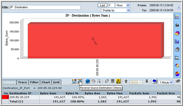
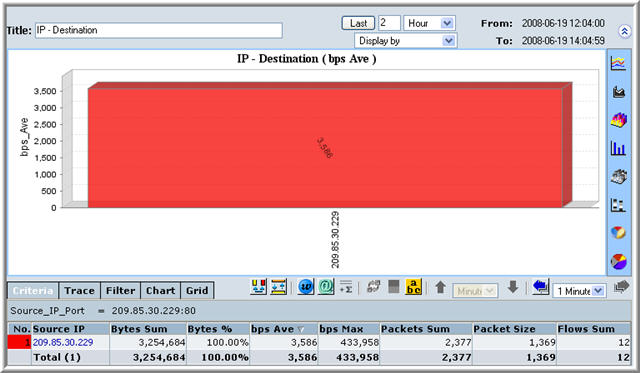
The two screenshots below illustrate the use of the Reverse Source Destination Criteria button. The button toggles between a source and destination for a given entity. In the two screenshots below, note that we have shown the criteria tabbed pane. This has been done to emphasize the current criteria of the graph. Here the graph is considered with respect to the IP address 209.85.30.229. In the screenshot immediately below, this IP is considered the source.
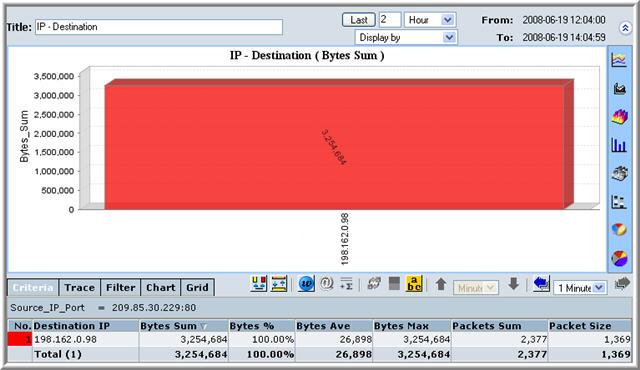
Once we press the button, the destination is 192.168.0.98, the graph now is of the destination IP.
Swap Source Destination Field Button
| This button, toggles between the source and destination for a particular data series. |
The two screenshots below illustrate the use of the Swap Source Destination button. In all graphs where there is a source and a destination, this button allows the user to toggle between the source and destination. In the screenshot immediately below we are looking at the source IP addresses.
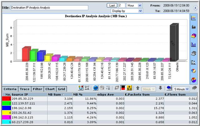
When the button is repressed, the bars in the 3D bar graph now show the destinations.
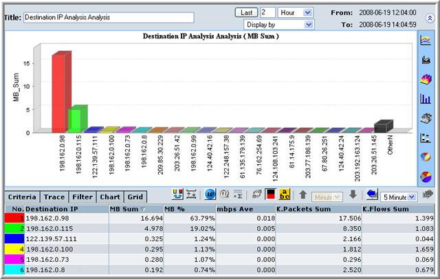
Chart Selection Buttons
Report as a Timeline Button
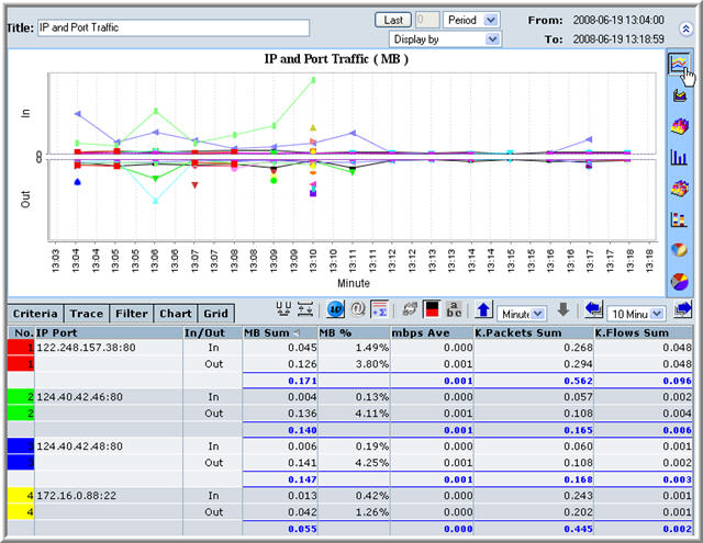
| Pressing this button will result in the data being represented by a timeline. |
A timeline graph measures some quantity that is indicated on the vertical axis by time, which is represented on the horizontal axis. In the screenshot below we have a bidirectional graph for IP and Port Traffic.
Report as a Stacked Timeline Button
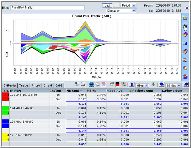
| Pressing this button will result in the data being represented by a stacked area timeline. |
This type of graph is very similar to the timeline graph in terms of the horizontal axis representing time. In this type of graph the area under the timeline is filled in while it is above another timeline series. In the screenshot below we have a bidirectional graph for IP and Port Traffic.
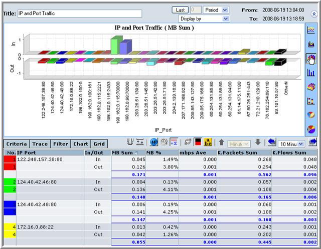
Report as a 3D BarChart Button
| Pressing this button will result in the data being represented by a 3D BarChart. |
This type of graph is among the simplest. The vertical axis indicates a quantity to be measured and the horizontal axis represents an entity that is being measured. In the graph below we have a bidirectional 3D BarChart, where the traffic of a particular IP address and Port is being indicated by the height of the 3D bar.
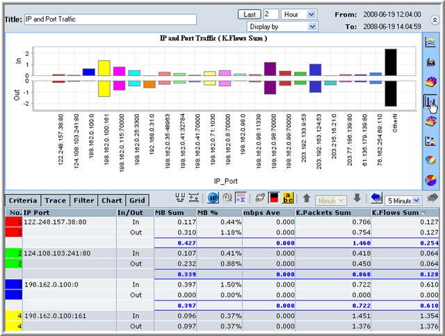
Report as a BarChart Button
| Pressing this button will result in the data being represented by a BarChart |
This type of graph is the simplest. The vertical axis indicates a quantity to be measured and the horizontal axis represents an entity that is being measured. In the graph below we have a bidirectional BarChart, where the traffic of a particular IP address and Port is being indicated by the height of the bar.
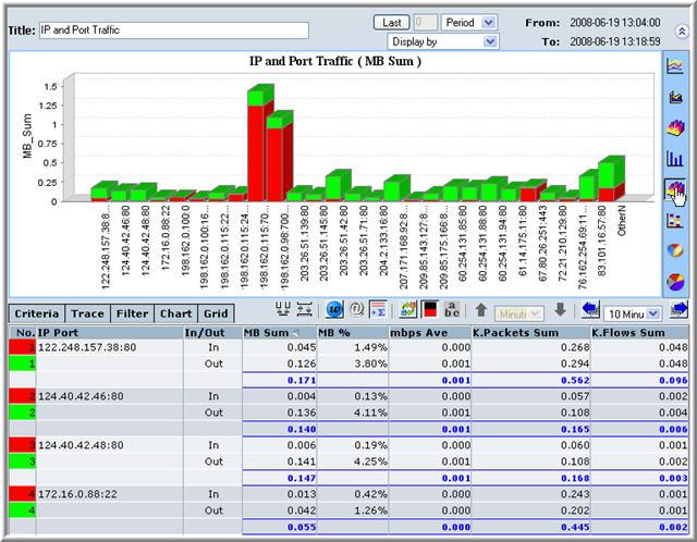
Report as a Stacked 3D BarChart Button
| Pressing this button will result in the data being represented by a 3D Stacked BarChart |
In this type of graph the vertical axis indicates a quantity to be measured and the horizontal axis represents an entity that is being measured. This type of graph differs from simple 3D BarCharts in the the bars represent more than one entity. In the graph below we have a bidirectional 3D BarChart, where the traffic of a particular IP address and Port is being indicated by the height of the 3D bar, the two red and green segments of the bar can also be seen in the data table, the red segment of the bar represents flow into an IP port and green represents flow out of an IP port. Here the user can also press the Swap Dimensions of Stacked BarChart button to represent all IP ports into an 'In' bar and an 'Out' bar.
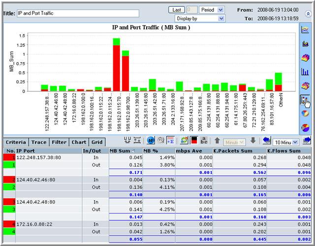
Report as a Stacked BarChart Button
| Pressing this button will result in the data being represented by a Stacked BarChart |
In this type of graph the vertical axis indicates a quantity to be measured and the horizontal axis represents an entity that is being measured. This type of graph differs from simple BarCharts in the the bars represent more than one entity. In the graph below we have a bidirectional BarChart, where the traffic of a particular IP address and Port is being indicated by the height of the bar, the two red and green segments of the bar can also be seen in the data table, the red segment of the bar represents flow into an IP port and green represents flow out of an IP port. Here the user can also press the Swap Dimensions of Stacked BarChart button to represent all IP ports into an 'In' bar and an 'Out' bar.
Report as a 3D PieChart Button
| Pressing this button will result in the data being represented by a 3D PieChart |
PieCharts are useful for determining the share or percentage of some quantity for a particular entity with respect to the total for all entities. In the graph below we are looking again at the bidirectional graphs for IP and Port Traffic. Here each slice of the pie is the proportion of the whole, of a particular IP port's flow. The pie graphic is shown in 3 dimensions.
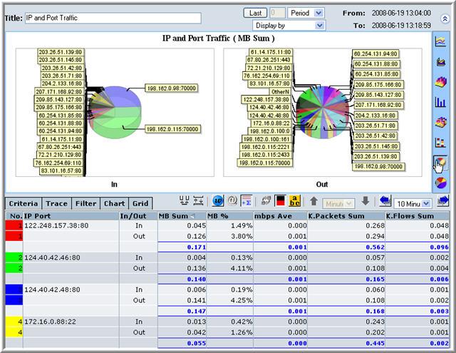
Report as a 3D PieChart Button
| Pressing this button will result in the data being represented by a PieChart |
PieCharts are useful for determining the share or percentage of some quantity for a particular entity with respect to the total for all entities. In the graph below we are looking again at the bidirectional graphs for IP and Port Traffic. Here each slice of the pie is the proportion of the whole, of a particular IP port's flow. The pie graphic is shown in 2 dimensions.

The Tabbed Pane
To the left of the Swap Source Destination Field button is the tabbed pane. On this pane there are five tabs, namely:
- Criteria Tab
- Trace Tab
- Filter Tab
- Chart Tab
- Grid Tab
These five panes will be discussed briefly below.
The Criteria Tab
When the user needs to drill down with respect to an entity (IP, Port, etc), this entity will be indicated in the criteria tab. This can be seen below.
The Trace Tab
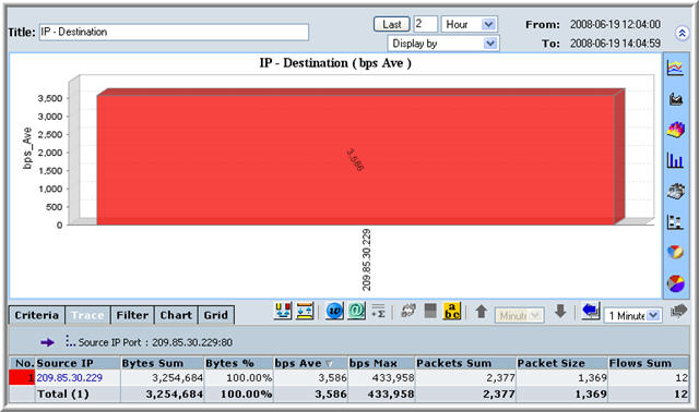
The entity in the criteria tab may interact with other entities, these are indicated on the trace tab.
The Filter Tab
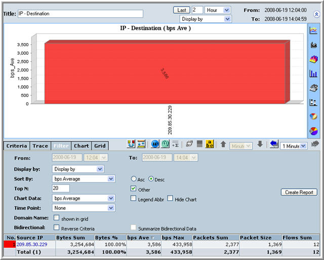
The filter tab allows the user to fine tune their reports.
The Chart Tab
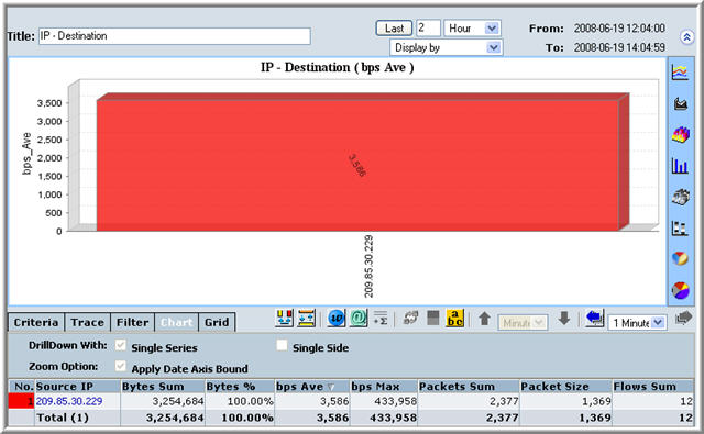
The Grid Tab
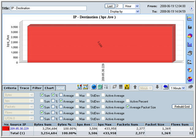
The grid tab allows the user the user to specify how the data in the graph will be collated. The user can select from a set of basic mathematical manipulations. These selections affect the number of columns in the data table. Notice in the screenshot below that there are seven ticks in the grid, and seven columns apart from the source IP in the data table.
The Chart Header
The chart header is seen whenever a report is generated, the screenshot below shows this part of the screen.

The chart header is made up of four components:
- The Report Title
- The Time Display
- The Display By Drag Down Menu
- The Show Chart Button
The Report Title
![]()
This simply tells you what kind of report has been generated. In the example above, we see an IP Traffic report.
The Time Display
![]()
Note that the diagram above has been edited to remove the Dispaly By Drag Down Menu, this has been done so that it is clear which components of the header are part of the time display. Note that there is a drag down menu and here it specifies Hour. This menu has the following options:
- Minute
- Hour
- Day
- Week
- Period
Choosing any one of these can redefine the period of time that the chart represents. This time being considered is shown on the right side of the time display where the beginning of the period is labelled From and the end of the period is labelled To. Note that the dates are displayed Year-Month-Day Hours:Minutes:Seconds.
The Display By Drag Down Menu
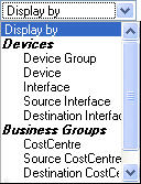 |
This drag down menu is yet another method to redefine the parameters of a graph. The image to the left shows the partially expanded menu. For example, if you selected a device group from the Real Time menu, you could use the Display By menu to investigate the IP traffic by selecting IP. |
The Show Chart Button
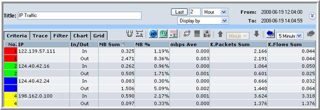
| Pressing this button simply hides the Chart. Pressing it again will make the Chart reappear. Below we see a screenshot of the applet when the Chart is hidden |
The My Analytics Menu |
^Top |
NetflowAuditor allows the user to generate reports in a multitude of ways. One further mechanism for generating reports is by using the My Analytics menu. This menu is shown below.
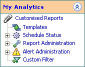
This menu allows the user access to NetflowAuditor's template system. To use this system, select My Analytics > Customised Reports > Templates, as shown below:
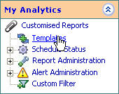
On selecting Templates the user will be presented with the screen shown below:
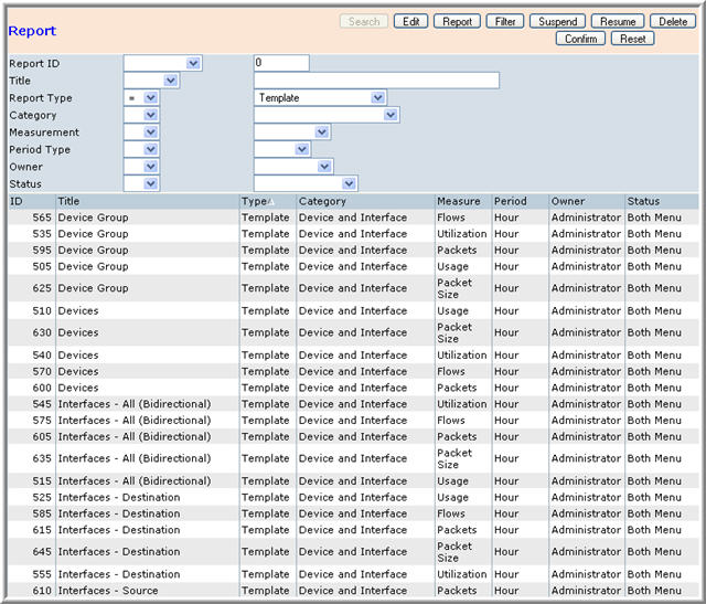
The screen is by default in the search mode, here the user can enter data into the fields to search for a required report type. Once they have finished entering the reports parameters they can press the Confirm button which will produce a list of reports that meet the users search parameters. An example of this has been presented below. Here a search was made for a template of the IP Address/Network/Range category.

The user can select any row by clicking on top of a particular row or entering the report identification number into the Search screen. The user can Edit an existing report by selecting a report, then pressing the Edit button. The parameters of the report should load into the top half of the window, just as in the screenshot below.
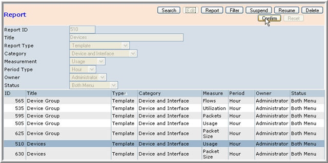
The image above shows the user about to press the Confirm button. Once this button is pressed the user is presented with the window below.
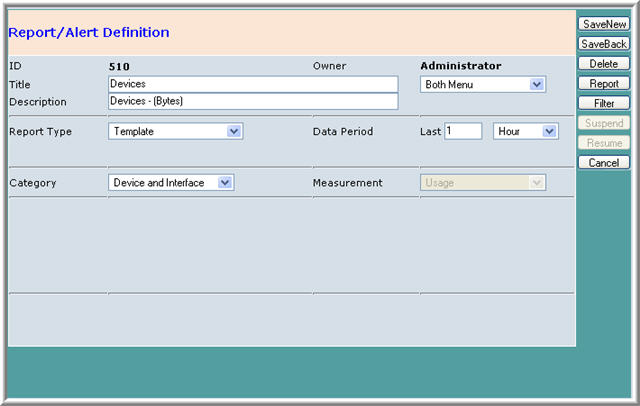
This process can be summarized as follows:
- Select template by single clicking row or executing search
- Press the Edit button
- The template loads so that the user can view parameters
- Press the Confirm button
This type of screen is discussed in the section on reports, and from here the user can filter, save or delete reports.
The process for deleting a template is similar, in that a template must be found on the list, then selected. The user procedes to select Delete at which point the template loads into the top half of the window, just as in the search above. The user can then press Confirm to delete the template. The process is as follows
- Select template by single clicking row or executing search
- Press the Delete button
- The template loads so that the user can view parameters
- Press the Confirm button
The process for generating a report is similar to deleting a report.
- Select template by single clicking row or executing search
- Press the Report button
- The template loads so that the user can view parameters
- Press the Confirm button
The user is taken to a to a report parameter screen, as shown below

Once the Report button is pressed the report is generated as usual. This could also have been achieved if the user had double-clicked the row entry on the table.
The process for filtering a report is similar to deleting a report.
- Select template by single clicking row or executing search
- Press the Filter button
- The template loads so that the user can view parameters
- Press the Confirm button
Doing this results in the window shown below. This is the filter screen that can be accessed at numerous points in NetflowAuditor. It can be seen that the fields in this screen are already filled in, as we are looking at a template.
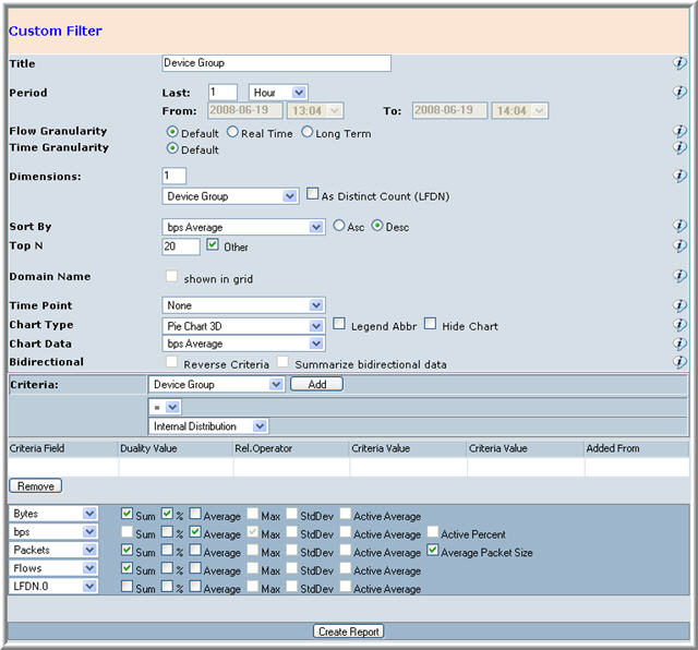
There are two more buttons, they are the Suspend and Resume buttons. These are used for reports that take time to generate.
Schedule Status Menu
To access the Schedule Status menu, simply select My Analytics > Schedule Status, as can be seen below:
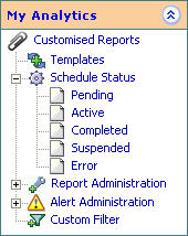
The Schedule Status menu can be expanded to include the following options
- Pending
- Active
- Completed
- Suspended
- Error
All of these choices lead onto a window that looks like the window below:

The user can keep track of reports that are in any one of the fives states mentioned above, namely: pending, active, completed, suspended and error. This is the list for the reports that the user has generated grouped according to state.
Report Administration Menu
This menu can be expanded for the user to select two further choices, these are:
- Definition
- Category
This can be seen in the image of the menu below.

When the user selects the Report Administration menu, they will be presented with a screen similar to the one presented below.

This is the Library of Reports that have been run on the user's system. Once the Definition menu has been seleced, the user has a choice of using the following buttons.
- Search
- Edit
- Report
- Filter
- Suspend
- Resume
- Delete
- Confirm
- Reset
These buttons function in an identical manner as those in the screen that can be accessed by My Analytics > Customised Reports > Templates. These buttons are described in the section above.
The user also has the option of selecting the Category menu which would result in the following screen if selected.

Once the Definition menu has been seleced, the user has a choice of using the following buttons.
- Search
- Add
- Modify
- Delete
- Confirm
- Reset
These buttons function identically to the way they do in the Configuration menu.
The Alert Administration Menu
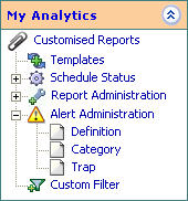

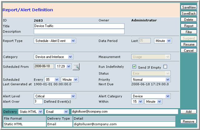


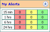
The Overview Screen
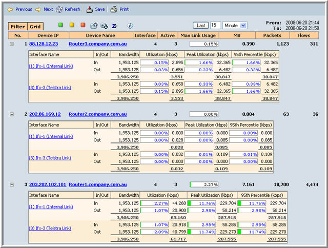
The first screen that the user sees after logging in is the Overview screen. A screenshot of this is presented below. The left hand side menus have been collapsed to save space.

The Overview menus will be explained in the following section. An image of the Overview menu is presented below.
![]()
The right hand side of this menu system uses the same type of interface that is used frequently in NetflowAuditor. The From label indicates the beginning of the period of consideration, in this case 2008-06-20 21:44, i.e., the 20th of June 2008 and 9.44pm. The To label indicates the end of the period of consideration, i.e., the same day 15 minutes later. The drag down menu that has the value Minute in the image above can be used to alter the period of consideration. To the left of this drag down menu is a textfield where the user can specify how many units of time to consider. The user then presses the Last button to change the period of consideration for the data.
Information Button
| This button simply presents information to the user for fine tuning the details of presented data. The information is in the form of a tool tip and reads "To Drilldown from an interface: Left Click for basic menu, Right Click for enhanced template menu. Click on the interface name or menu. Click on the Interface name or Device for time trend analysis" |
The Show/Hide Totals Button
| Pressing this button results in the totals for all columns of data in the Overview section being hidden. Note the little minus sign within the icon. | |
| Pressing this button results in the totals for all columns of data in the Overview section being shown. Note the little plus sign within the icon. |
This functionality is best illustrated using an example, such as the one below.

The table in the above image is shown with totals which is the default presentation. Pressing the Show/Hide button (note the minus sign) will remove the totals and result in a table that looks like the one below.

The Collapse and Expand All Buttons
| On entering the Overview screen the data for devices is presented in a collapsed state as shown in the image below. Pressing the above button expand the data which is shown in the second diagram below. |

| The collapse all button is pressed when the Overview screen looks like the one below, to produce a screen that looks like the one above. |
Show All/Warnings/Critical Button
|
Pressing this button will result in the all the data being displayed in tabular form. |
|
Pressing this button will result in all warnings being displayed in tabular form. |
|
Pressing this button will result in all critical usage being displayed in tabular form. |
The use of these three buttons will be demonstrated in the following example. In the image below the user has specified the last month as the time period for which they would like a review. Placing the cursor over any of the bars in the Peak Utilization column, results in a tool tip that informs the user of the time of the peak flow. Here the user is informed that the peak occured on the 16th of June at 7:10 am.
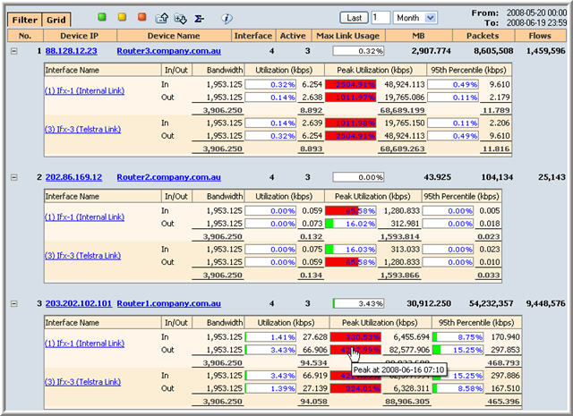
The user would like to concentrate on the 16th of June and investigate the period around the peak time. This is done in the following way. The user selects Period from the time drag down menu as in the following image.
![]()
The user then selects the Filter tab and changes the dates to the 16th of June as in the following images.
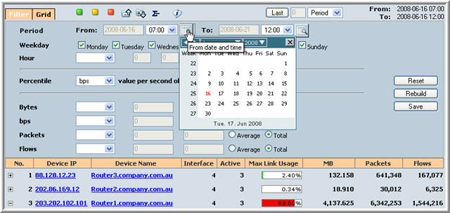
The user then changes the starting time of the period to 6:00 am. This is shown below.
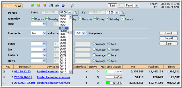
The user then changes the finishing time of the period to be midday on the 16th of June and presses the Rebuild button which results in the following screen.
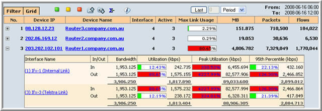
Note that the third Interface has been expanded. Pressing the Show Critical button will result in the following screen.

At this point, broadening the period to all of the 16th of June, i.e., From is 2008-06-16 00:00 and To is 2008-06-16 23:59 results in the following screen.
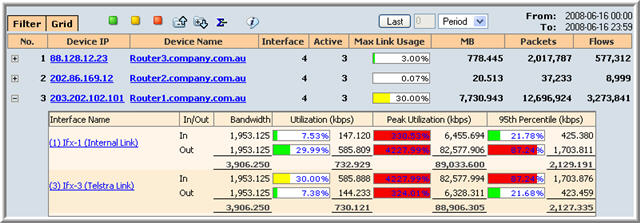
Selecting the Show Warning button results in the screen that is presented below.

The Grid Tab
The Grid tab allows the user to add more columns of processed data to the table of the Overview screen. This tab is similar to Grid of the Chart applet

The Filter Tab
The Filter tab allows the user to modify the parameters of the data. This tab is similar to Filter of the Chart applet.
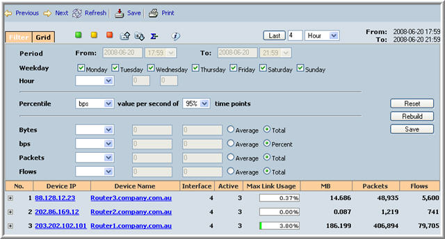
Using the Basic Menus
The basic menus allow the user to Drilldown for
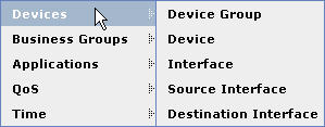
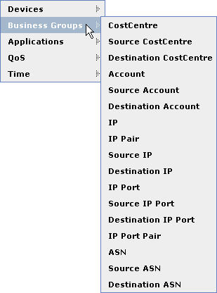
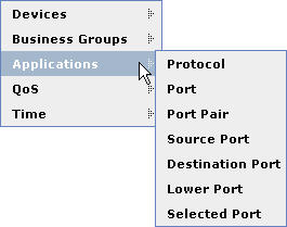
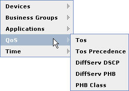
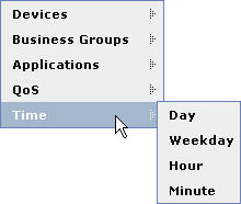
Using the Enhanced Template Menus
See section on graphical menu.
The Header Menu
The Heading menu is at the top of the browser screen, this menu is shown below.
![]()
![]()
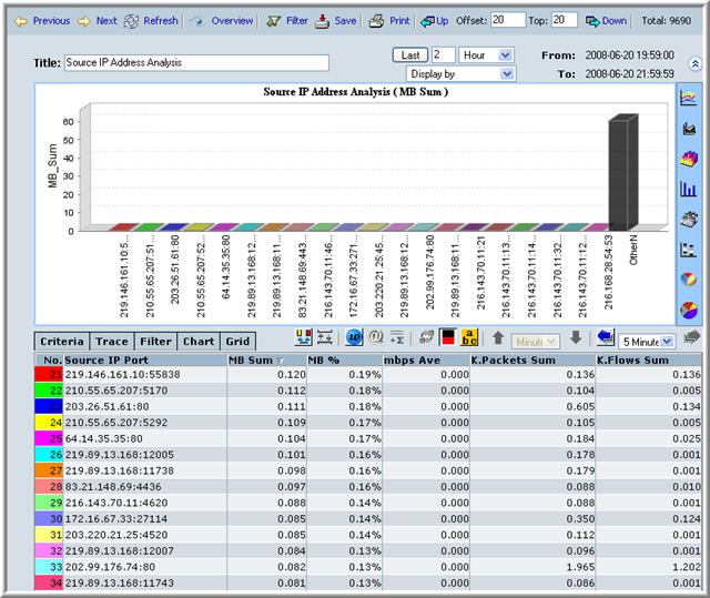
Save
Filter
Overview
Refresh
Next
Previous


